Volume 1, Year 2014 - Pages 50-59
DOI: 10.11159/jmta.2014.006
The Effect of Fonts Design Features on OCR for Latin and Arabic
Jehan Janbi¹,², Mrouj Almuhajri², Ching Y. Suen²
¹Department of Computer Science, Taif University Airport Rd, Al Huwaya, Taif, Saudi Arabia
jjanbi@gmail.com
²CENPARMI Concordia University, 1515 St. Catherine W. Montréal, QC, Canada
mrouj.mm@gmail.com; suen@cs.concordia.ca
Abstract - Huge digitized book projects have been launched recently like Google Book Search Library project and MLibrary. They basically depend on optical character recognition systems (OCR) to convert scanned books or documents into editable and text searchable e-books. Although research on OCR area pursued over decades, very few of them focus on the effect of typeface design on the recognition rate. We took a further step by conducting systematically two observational experiments on Latin and Arabic typefaces using OCR tools. A collection of 18 Latin and 13 Arabic typefaces have been tested in two sizes using six OCR packages in total. In addition, confusion tables have been constructed to show similarities among some characters of the alphabet. Extensive analyses were made to find correlations between the recognition rates and font design characteristics. Our findings indicate that some font design features showed influence and negative effects on the recognition rate. This will guide typeface designers to produce recognizable typefaces and publishers to select the appropriate recognizable fonts.
Keywords: Typography, type design, OCR, digitized book, recognition, English, Arabic.
© Copyright 2014 Authors - This is an Open Access article published under the Creative Commons Attribution License terms. Unrestricted use, distribution, and reproduction in any medium are permitted, provided the original work is properly cited.
Date Received: 2013-09-24
Date Accepted: 2014-03-25
Date Published: 2014-06-04
1. Introduction
Enormous amount of studies have been done on optical character recognition along the history in order to increase the recognition accuracy for both printed and handwritten characters. The improvement of recognition can be effected by modification of OCR stages, such as pre-processing, segmentation, features extraction or recognition stage. Several studies addressed different features to be extracted in purpose of increasing OCR accuracy for Latin and Arabic scripts. In [1], a survey has been done on many studies that used different features extraction techniques for Latin, such as zoning, calculating moments and number of holes and points of the character. For Arabic, in [2] more than one feature extraction method has been used. In particular, information about pixels density and concavity has been collected using the sliding windows, in addition to extracting skeleton directional-based features on main zones. In [3], Hough transform was selected as features for Arabic.
Accuracy of recognition for printed text has not been discussed from the perspective of digital font design. Since font design features play an essential role in impacting the recognition rate of printed texts, our research centre has highlighted this area in two of its studies on Latin and Arabic scripts. The goal is to guide typeface designers to produce recognizable typefaces and publishers to select the appropriate recognizable fonts.
In the present paper, we proposed the influential design features that would mislead commercial OCR systems. This had been reached by conducting two experiments. Each of which used more than one OCR systems to evaluate 31 Latin and Arabic fonts. Then, results went into sub-stages including font features measurement and finding characters similarity. Therefore, correlations have been found between the misrecognized letters and their design features.
This paper discussed the related work in section 2. Then in section 3, we described experiments done on Latin and Arabic printed text using commercial OCR. Next, the results were analysed and discussed in section 4. Finally in section 5, recommendations for some font design features were specified for designers and publishers in order to afford recognizable fonts by OCR systems.
2. Related Work
Earlier, OCR devices were able to read input from specially designed fonts. Later, with the development of OCR technology, some standardization was set for OCR fonts. In 1968, two fonts OCR-A and OCR-B were produced to be recognized by specific OCR devices. OCR-A was one of the first standard typefaces for OCR, and it was produced by American Type Founders. Although OCR-A was designed to be simple for machine to recognize its alphabet, it is not very legible for human eyes. Thus, OCR-B was provided by Adrian Frutiger for Monotype in which the design is recognizable by machines and legible for humans [4]. It is designed following the European Computer Manufacturers Association Standards (ECMA). The main principle in its designing is that all characters must differ from each other at least in worst case by 7% when they are superimposed over each other. In order to do so, using serif was avoided because it increases the coverage area of the character which will increase the similarity between characters. To differentiate similar shape characters, such as (i, j, l), serif, horizontal bar or curved stroke may be added [5]. Several design principles of OCR-B had been applied in designing OCR-D font for Devanagiri script. OCR-D gave better results when it was tested using commercial OCR compared to other fonts [6].
Although research has been done on optical font recognition (OFR) problems, none of them, to our knowledge, raises that the design of fonts could affect the recognition process. Zramdini and Ingold [7] provided a statistical approach for OFR based on global typographical features to classify the fonts under five attributes typeface type, weight, slope, width, and size. A similar experiment was done by Abuhaiba [8] on Arabic based on templates to recognize the font under similar attributes except for the width due to the connected letters and cursive nature of Arabic script. Cooperman [9] took the estimation of font attribute into discussion in OCR systems. That is, to detect individual attributes of fonts, he used local characteristics, such as serif, sans serf, contrast … etc. Most of these font methodologies relied on the extraction of local attributes and how they affect OFR, but there is no focus on how the feature of the font itself affecting the recognition rate.
Some studies showed how font design features could affect the legibility of specific characters. One of the recent researches [10] examined the legibility of isolated letters, individual digits, and symbols of 20 onscreen typefaces. Experiment have been conducted on ten subjects completing 188 trials in which the characters were exposed in a single presentation for 34 milliseconds, and subjects were asked to name them aloud. The results yielded the most confused characters: (number 0 → letter o, number 1 → letter l, e→c,÷ →t, and $→letter s and number 5). Then, classification tree analysis has been applied considering font design features for the mentioned characters. Therefore, it was recorded that specific font characteristics: Height, Perimeter, Midline, Height, Stem dot height, and weight of characters: 0, 1, e, l, ÷, and $ respectively are the most influential features at some particular measurement. For example, if the Midline feature of letter e (which is the ratio of the height from baseline to the centre horizontal to the overall height) is less than 0.61 pixels, it considers legible. Another study was done by Sofie Beier and Kevin Larson [11] in which they designed two experiments to investigate the legibility of created variations of the most misrecognized letters. They designed three fonts; each contains letters noticed to be highly misrecognized by previous studies "e-c-a-s-n-u- i-j-l-t-f". Within the same font, each character had more than one variant letter form. For instance, the variation of letter "i" was made in serif level to emphasize the separation of the stem from the dot, while the narrow characters, such as "l,t,f,j" are widen to increase their areas. The results provide some design recommendation that would enhance legibility. It is recommended to double storey "a" rather than one storey because of its lower legibility. In addition, wide version of narrow letters and expanding letters into ascending and descending areas are advised. The other variations did not confirm their effect on legibility. Nevertheless, the discussed studies examined font design features from human perspective only, and that could be different from OCR.
3. Experiments
Two experiments have been conducted [12],[13] to analyze the impact of typeface design characteristics on OCR recognition rates. One of the experiments has been conducted on Latin typefaces while the other on Arabic.
3. 1. Selection of Fonts and OCR Systems
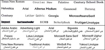
A set of 18 Latin typefaces (nine serif: Times New Roman, Courier New, Palatino, Century School Book, Garamond, Batang, Century, Georgia and BerkerlyBook; and the remaining nine are sans serif ) was selected based on their widespread usage besides their special properties. Two different sizes were considered, 8 and 10 points, resulting in 36 fonts in total. Lower case letters only were included in this study. The recognition rate is measured using four well-known commercial OCR systems: ABBY FineReader 6.0 pro, TypeReader 6.0 pro, TextBridge pro millennium, and Omnipage pro 12.0. Another set of 13 Arabic typefaces have been chosen based on their common usage in books, magazines, and newspapers. A total of 26 fonts were tested in two sizes 10 and 12 points. To determine the recognition rates on Arabic, two of the best commercial Arabic OCR systems were used: Readiris pro 12 Middle East and Sakhr Gold Edition 8.
3. 2. Data Set
The quality of the input data has great impact on the accuracy of OCR. Generally, the history of document, printing process, font clarity, and data acquisition method are factors that may affect the quality of input data. The documents that have been copied or faxed several times would become harder to read and produce much noise when scanned. In addition, the typeset documents are clearer than typewritten and than the ones that produced of dot-matrix printers. Regarding fonts, small, exotic, italic, bold, sub or super scripts fonts also have an effect on OCR input quality. The acquisition method also has an effect on the quality of input data. With offline acquisition, when documents are scanned, the text may be skewed or stretched. For on-line acquisition, distortion may appear, such as zigzags. In both cases, the resolution of the machine also would influence the quality of text images. Therefore, in ordinary OCR model, the input data pass through pre-processing stage to reduce or remove all noise, distortions, variation and details that are meaningless for OCR [14], [15]. In our experiments, since the focus is to analyse the fonts design features, the documents have been generated by computer to avoid the noise and distortion that may happen during scanning process. The documents then have been converted to binary image. No normalization has been done to keep the effect of font size and variation of fonts themselves. For English data set, eight documents have been created. The contents of the text included high and low frequency words, bigram words, high frequency N-Gram words, and nonsense words documents from elementary books, Better Type, and Devoghelaere report. For Arabic data set, six documents have been created including a collection of low, medium and high frequency words. Also, they included texts taken from Arabic newspapers and Arabic font specimen books.
3. 3. Experimental Design and Procedure
3.3.1 OCR Experiments
The four English OCR systems were fed by eight texts with 2244 words and 7859 characters in total. Text samples were converted into 200 × 200 dpi binary images. Then, a dynamic string matching algorithm (Levenshtein distance) is used to compare OCR output with the corresponding input ground truth in order to catch misrecognized letters. In Arabic experiments, both OCR systems were applied to a set of six samples including 3071 words. Those samples had been converted to images with 300 × 300 dpi resolution. Then, the same matching algorithm was used to find the misleading letters. Figure 2 describes the experiment procedure.


3.3.2 Measuring Font Design Features
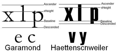
From the perspective of typeface design, font features were measured for both scripts Latin and Arabic. Since Arabic font features are totally different than Latin, different gauges have been used. Figure 3 shows the main design aspects for both scripts [16]. The baseline is where all characters are set on. Based on that, the other features are determined. For Latin, the xHeight is the height of lower case 'x' from baseline; Ascender is the height that extends above x-height; Descender is the portion of the character that extends under the baseline. Arabic typeface features differ regarding to diversity of writing scripts. Instead of xHeight, there are tooth and loop height as in letter (ق) , (ش) respectively. Thus, there are two ascenders: one extends above loop height whereas the other extends above tooth height [17], [18].
Some features like fixed and variable spacing, serif, and sans serif were detected using Fontlab4.5 in addition to human observation. Other font features were calculated using mathematical equations, and the needed terms like xHeight, ascender and descender were determined from the projection profile based on the method used in [7]. For all measured values, pixel unit was used. In Latin, the proportion of xHeight, ascender XA, and descender XD were computed using equations (1) and (2).


Equation (3) measures the vertical and horizontal stroke thickness, weight Wi , in which Ti representing the average of vertical and horizontal stem thickness of all letters for each font considering the most frequent vertical and horizontal black runs.
 [i=vertical, horizontal]
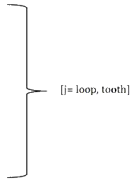
In Arabic, The aspect ratio AR of a character, as in equation (4) was calculated using the letter 'Seen' (س). The contrast C is the ratio between the thickness of vertical Tv and horizontal Th strokes as in equation (5). This gauge is calculated using three isolated letters 'Kaaf' ((ك, 'Alef' (ا) and 'Beh' (ب). The weight of typeface Wij , that expresses its heaviness, was measured by equation (6). Four different weight proportions were calculated as ratio of the vertical and horizontal stroke to the loop and tooth height. The measurements were calculated using isolated letters 'Alef' (ا), 'Feh' (ف) and 'Beh' (ب).


 [i=vertical, horizontal] [j= loop, tooth]
Furthermore, different proportions between main design features have been calculated. The word height WH was calculated by the difference between bottom and top of the word. Since Arabic typeface has loop and tooth, it has two ascenders ascenderj, one extended above the loop and the other extended above the tooth and they were measured by finding the difference between loop/tooth height Hj and top. On the other hand, the descender in Arabic is the lower part under baseline and its value is the difference between bottom and baseline. The value of word height WH was used to calculate the proportion with two heights HPj, loop and tooth, as in equation (7). The proportion between the two ascenders ascenderj and the word height WH were calculated as in equation (8). Moreover, the proportion between the word height WH and descender has been calculated as in (9) using letter 'Meem' (م). The ratio among three measurements, tooth/loop height, ascender and descender, have been calculated using equations (10) (11) (12).



3. 3. 3. Character Shape Similarity
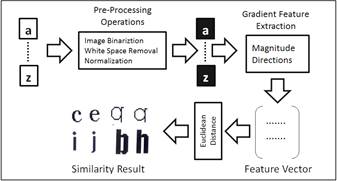
For both scripts, similarity distances have been calculated for each pair of letters within the same font to determine which pairs of letters are vulnerable to be misrecognized. To estimate similarity, gradient features, magnitude, and directions of the greatest change in intensity in a small neighbourhood for each pixel were extracted for each character image. A sequence of pre-processing operations had been done including image binarization using Otsu threshold, white space removal suing bounding box techniques, and normalization using linear interpolation algorithm. In the normalization step, the two following equations (13) and (14) were used where (i,j) are the dimensions (width, height) of the original letter image, and β = max (I/32, J/32) in which (I,J) are the dimensions of the cut image.


Then, for each letter image a feature vector of size 400 was produced having 5×5 vector and 16 directional resolution for Latin and vector of size 512 (4×4) and 32 directional resolutions for Arabic using Roberts Operator model. Then, a threshold was applied to nullify pixels with low gradient magnitude to highlight the important information for similarity measurement. The Euclidean distance was used to calculate similarity for each pair. Figure 4 illustrates the procedure of extracting character shape similarity.
For each Latin font in this study, the lower case of letters from "a" to "z" is compared with lower case letters from "a" to "z" and upper case letters from "A" to "Z" coming up with 26 × 52 pairs. For Arabic, the total number of characters is 112, which includes the four shapes for 28 letters. The similarity distance has been calculated for 112×112 pairs for each font.
3. 4. Results
3.4.1. Results of OCR Experiment
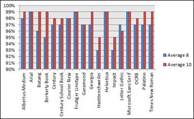
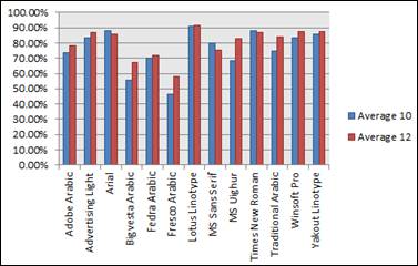
In general, a bigger size provides a better performance in all used OCR systems. Accuracy for English OCRs (93% - 99%) is much better than Arabic OCRs (46% - 91%). Figure 2 illustrates the average recognition rates for all tested English and Arabic fonts.
3.4.2 Results of Measuring Font Design Features
For both Scripts, the maximum and minimum values were obtained for each proposed font feature. Also, the average of all measured features was calculated. Table 1 is listing these values for Latin and Arabic respectively. These obtained facts have been used later in the analyses regard finding factors affect recognition process negatively.
Table 1. Max, Min, and Average Values of All Measured Font Features for Latin and Arabic.
|
Features |
Maximum |
Minimum |
Average |
Features |
Maximum |
Minimum |
Average |
|
Latin Font Features |
|||||||
|
XA |
Haettenschweiler + Impact 4.5 |
Berkerly Book 1.50 |
2.43 |
Wv |
Haettenschweiler + Impact 0.28 |
Georgia 0..07 |
0.17 |
|
SD |
Haettenschweiler + Impact 6.0 |
Palatino 1.63 |
2.78 |
Wh |
Haettenschweiler + Impact 0.17 |
MS Sans Serif 0.17 |
0.11 |
|
Arabic Font Features |
|||||||
|
AR
|
Bigvesta 1.82 |
Fresco 1.32 |
1.5623 |
APtooth |
Traditional Arabic 0.4630. |
Times New Roman 0.319. |
0.3822 |
|
C
|
Fresco 1.4576 |
MS Uighur 0.5571. |
0.8338 |
DP |
Lotus Linotype 0.4727. |
MS Sans Serif 0.2165. |
0.3612 |
|
W horizontal/loop
|
MS Uighur 7 |
Fresco 1.15 |
4.6611 |
HAloop |
Fresco 2.04 |
Traditional Arabic 0.6452 |
1.2173 |
|
W horizontal/tooth
|
Lotus 18.7778 |
Fresco 1.475. |
6.6905 |
HAtooth |
Bigvesta 1.2571 |
Lotus Linotype 0.1525 |
0.7303 |
|
W vertical/loop
|
WinSoft Pro 5.16 |
Fresco 1.68. |
5.16 |
HDloop |
Fresco 2.3182 |
Traditional Arabic 0.4762 |
1.1269 |
|
W vertical/tooth
|
Lotus 12 |
Fresco 2.15. |
4.8 |
HDtooth |
MS Sans Serif 1.9524 |
Lotus Linotype 0.1731 |
0.9655 |
|
HPloop |
Fresco 0.52 |
Traditional Arabic 0.2151 |
0.34 |
ADloop |
MS Sans Serif 1.6667 |
Adobe Arabic 0.6111 |
0.8966 |
|
HPltooth |
Fresco 0.41 |
Lotus 0.0703 |
0.26 |
ADtooth |
MS Sans Serif 2.2381 |
Yakout Linotype 1.0294 |
1.2937 |
|
APloop |
MS Sans Serif 0.3608. |
Fedra 0.2427. |
0.2913 |
|
|
|
|
3.4.3 Results of Character Similarity
From character similarity measurement huge amount of distance data were generated for both scripts. Table 2 shows the average distance of each case font in which high average distance means more vulnerability of having recognition errors.Figure 6 shows sample pairs of similar characters for Latin and Arabic scripts.
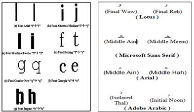
Table 2. The Average Distance for each Font from Character Similarity Measurement.
|
Font Name |
Average distance |
Font Name |
Average distance |
|
Latin Fonts |
|||
|
Albertus Medium |
111.7182 |
Georgia |
92.4798 |
|
Arial |
130.4506 |
Heattenschweiler |
91.46082 |
|
Batang |
93.02068 |
Helvetica |
130.6329 |
|
Berkerly Book |
79.88246 |
Impact |
93.47969 |
|
Century |
92.65556 |
Letter Gothic |
76.54783 |
|
Century School Book |
92.70812 |
Microsoft San Serif |
130.6888 |
|
Courier New |
78.55499 |
OCRB |
119.2179 |
|
Frutiger Linotype |
126.009 |
Palatino |
94.5982 |
|
Garamond |
90.62936 |
Time New Roman |
94.15444 |
|
Arabic Fonts |
|||
|
Lotus Linotype |
35.68 |
MS Uighur |
31.96 |
|
Yakout Linotype |
33.95 |
Adobe Arabic regular |
36.93 |
|
WinSoft Pro |
33.84 |
MS Sans Serif |
30.14 |
|
Advertising Light |
35.01 |
Fedra |
34.14 |
|
Times New Roman |
33.85 |
Bigvesta |
32.90 |
|
Arial |
33.85 |
Fresco |
33.78 |
|
Traditional Arabic |
32.24 |
|
|
4. Analyses and Discussion
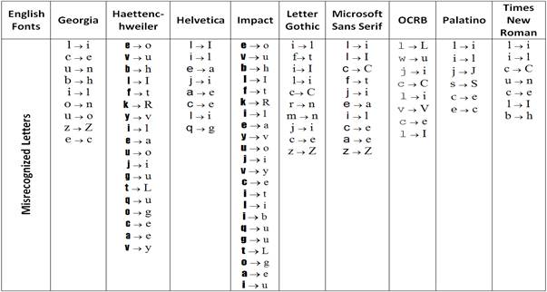
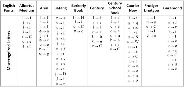
After getting the recognition rates from OCR tools for all font sets and measuring font design features, the following observation and statistical correlation have been highlighted using Spearman test. For Latin, it is observed that long serif design of individual letters cause misclassification on (b,h), (u,n), (o,n), (o,u). In addition, balancing is required among x-height, ascender, and descender. That is, if the x-height is very short, it produced many errors of central letters especially in small size. Garamond is an example and it showed recognition errors with: (e,c), (o,r), (c,r), (a,s). Else, if x-height is larger than ascender and descender, it gave unclear letters causing errors, such as (i,j), (v,y), (g,u), (q,u), (o,g), (f,t) in Heattenschweiler and Impact fonts. Figure 7 provide explanatory example of x-height comparing with the ascender and descender. Moreover, the extreme and light thickness of stroke decreased the recognition rate because a very thick stroke makes a letter look very dark, narrow, and with little white space inside the letter leading to errors like (e,c), (e,o), (a,e). Though, light strokes such as in BerkerlyBook and Courier New decreased recognition rate particularly in small size. Table 1 presents the misrecognized letters for each Latin font.
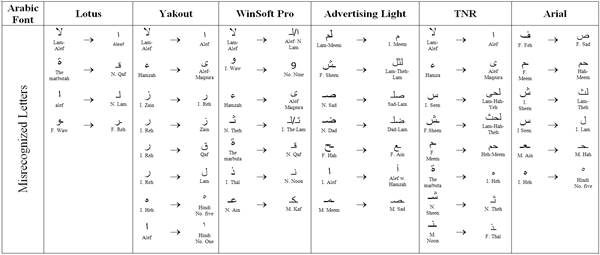
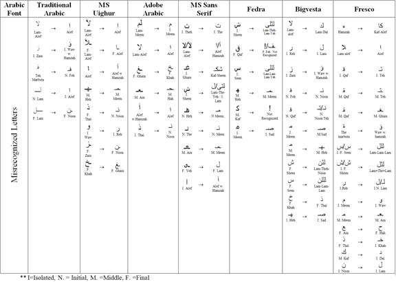
For Arabic, there are moderate to strong positive correlation between the loop and tooth height and accuracy of OCR recognition. The fonts that have loop height around average = 4.88, and tooth height also around average= 5.7 are having a high recognition rate. Other than that, problems could accrue due to two reasons: having different tooth height in one character, and having very long or short loop height near the maximum or minimum values. Figure 8 shows letter "Sin" in Fresco font with different tooth heights in the same letter causing OCR systems to recognize it as three connected letters "Lam". Figure 9 illustrates very long loop height in Fresco font and very short loop height in Microsoft Uighur leading to errors in the recognition process of letter "Qaf" and "Wow". Moreover, the proportion of the ascender to descender should not be very big. Having this proportion around 0.7-0.8 could be good enough to produce a high recognition rate. Table 2 shows the misrecognized letters for each Arabic font. The other measurements showed weak correlation to the OCR accuracy.


From the similarity experiments, pairs of letters observed to be frequent by misrecognized. For Latin fonts, it is found that some common character pairs which have similar shape design with low distance value increased recognition errors especially with sans serif fonts such as, lower case of letter 'l' and upper case of letter 'i' of fonts Arial, FrutigerLinotype, Heattenschweiler, Helvetica, Impact, and Microsoft Sans Serif. For Arabic fonts, there was misrecognition with low distance between four different forms of a letter (initial, middle, final and isolated) in general. Also, the letters that have the same basic letter form and differ only in the number of dots, such as "sin" and "shin" are frequently misrecognized.
5. Conclusion
This paper has addressed the idea of font features that negatively affect OCR. The main aim is to prove that typeface design characteristics may have an influence on the recognition process. Two studies have been conducted on Latin and Arabic scripts on a total of 31 fonts in two sizes. Six commercial OCR systems have been used in these experiments providing better accuracy for larger size in general. Then, font design characteristics were measured. Results of OCR and font design measurement were analyzed and observed. So, it is found that some font design features are associated with fonts that have high recognition while others did not give any correlations. Further studies can analyze the effective font design features as a combination instead of having them individually, and find the correlations between them in order to produce clear recognizable font characteristics. The results have shown that different fonts produce different OCR recognition rates. This study can be used as a guide to choose more legible digital fonts for electronic display digital publishing and human application.
Acknowledgements
The authors would like to thank Ying Li and Mehri Saeid for conducting up the preliminary OCR experiments, and NSERC, Concordia University, and Saudi Cultural Bureau for financial support.
References
[1] R. Verma and J. Ali, "A-Survey of Feature Extraction and Classification Techniques in OCR Systems," International Journal of Computer Applications & Information Technology, vol. I, no. III, 2012. View Article
[2] H. E. Abed and V. Margner, "Comparison of Different Preprocessing and Feature Extraction Methods for Offline Recognition of Handwritten ArabicWords", in Document Analysis and Recognition, ICDAR, Ninth International Conference, 2007. View Article
[3] S. Touj, N. B. Amara and H. Amiri, "Generalized Hough Transform for Arabic Optical Character Recognition," The International Arab Journal of Information Technology, 2(4), 2005. View Article
[4] OCR-B Std Read Me, Adobe Systems Incorporated, 14 Jan 2013. [Online]. [Accessed 26 April 2013] View Article
[5] H. Osterer, P. Stamm and Swiss Foundation Type and Typography, "Adrian Frutiger – Typefaces: The Complete Works", Walter de Gruyter, 2009, pp. 179-183. View Book
[6] M. Saifee, "Devanagari Font Design for Optical Character Recognition", Bombay: Indian Institute of Technology Bombay, 2012. View Article
[7] A. Zramdini and R. Ingold, "Optical Font Recognition Using Typographical Features," IEEE Transactions on Pattern Analysis and Machine Intelligence, vol. 20, no. 8, August 1998, pp. 877-882. View Article
[8] I. Abuhaiba, "Arabic Font Recognition Based on Templates," The International Arab Journal of Information Technology, vol. 1, pp. 33-39, 2003. View Article
[9] R. Cooperman, "Producing Good Font Attribute Determination Using Error-Prone Information," in Proc. SPIE 3027, Document Recognition IV, San Jose, 1997. View Article
[10] B. S. Chaparro, E. C. Merkle, D. E. Fox and A. Chaparro, "Examination of the legibility of isolated characters of onscreen typefaces," Information Design Journal, 19(1), 2011, pp. 28-45. View Article
[11] S. Beier and K. Larson, "Design Improvements for Frequently Misrecognized Letters 1," Information Design Journal, 18(2), 2010, pp. 118-137. View Article
[12] M. Saeid, "Discovering The Effect Of Arabic Typeface Design Characteristics On Font Legibility From OCR Point Of View". (Unpublished master dissertation), Montreal: CENPARMI. Concordia University, 2012.
[13] Y. Zhang, "The Effect of Font Design Characteristics on Font Legibility", (Unpublished master dissertation), Montreal: Concordia University, 2006. View Article
[14] B. Al-Badr and S. A. Mahmoud, "Survey and bibliography of Arabic optical text recognition," Signal processing 41, vol. 1, pp. 49-77, 1995. View Article
[15] I. Ahmed, S. A. Mahmoud and M. Tanvi, "Printed Arabic text recognition," in Guide to OCR for Arabic Scripts, London, Springer, 2012, pp. 147-168. View Article
[16] C. Y. Suen, S. Nikfal, B. Zhang, J. Janbi and N. Dumont, "Personality Traits of Typface for English, Chinese and Arabic," in Proceedings of ATypeI Conference, Hong Kong, 2012. View Article
[17] H. S. AbiFares, "Arabic typography a comprehensive sourcebook", London: Saqi Books, 2001. View Article
[18] E. Smitshuijzen, "Arabic Font Specimen Book", Amsterdam: Uitgeverij de Buitenkant, 2009. View Article

